Disclosure: The views and opinions expressed here belong solely to the author and do not represent the views and opinions of crypto.news’ editorial.
The crypto industry, fuelled by mainstream adoption, blockchain partnerships, and groundbreaking innovations like decentralized finance, is poised to reach a staggering $40.7 billion by the end of 2023, marketing an impressive annual growth rate of 14.40%. This trajectory is projected to continue, with the market’s total value estimated to hit $68.8 billion by 2027.
This rapid growth has increased demand for well-crafted crypto projects, where design plays a crucial role in shaping project perceptions and indicating the quality and seriousness of the creators.
In the early days of cryptocurrency, design was used as a badge of rebellion against the traditional financial world. Projects embraced a neon-lit, futuristic aesthetic with bold color, cosmic references, and 3D graphics. This style was meant to convey the revolutionary spirit of crypto and its potential to disrupt the status quo.
However, this rebellious approach often came at the expense of usability and professionalism. Many projects lacked a coherent product strategy, and their branding failed to inspire trust among potential users and investors. This, coupled with the proliferation of scams and Ponzi schemes, such as the OneCoin case, which raked in a staggering $350 million, and the BitConnect scheme, with a market capitalization of over $95 million, further tarnished the reputation of the crypto space.
Today, the cryptocurrency market has matured, and with it, the design of crypto projects. There is a growing emphasis on simplicity, usability, and professionalism, driven by several factors, including:
- The influx of new users: As cryptocurrency becomes more mainstream, it attracts a broader range of users, including those new to technology and design that are easy to understand and navigate.
- The need for regulatory compliance: Governments worldwide are increasingly scrutinizing the cryptocurrency industry, with major players such as Binance implementing training programs covering policing financial crime with digital assets and crypto.
- The desire to build trust: The crypto industry has suffered from a lack of trust. Consequently, projects are adopting elements of design that convey trustworthiness, such as clear branding, a user-friendly interface, and a focus on security. It is not a coincidence that web3 has attracted over $100 billion in investment, with web3 startups raising $7.1 billion in 2022.
That is why over 30% of cryptocurrency projects embrace a simple design style, drawing inspiration from companies like Apple. It is characterized by its minimalist forms, expansiveness, and dynamism and conveys a sense of elegance, sophistication, and innovation. This shift reflects the industry’s growing focus on legitimacy, credibility, and user trust, as investors are no longer drawn to flashy “childish” gimmicks—they want to invest in projects that appear reliable, stable, and trustworthy.
Suicide Ventures provides an excellent example of this design evolution—from vibrant and playful design to a more refined and sophisticated approach. Today, the firm’s design reflects its position as a leading player in the industry, projecting an image of professionalism, trust, and innovation. Here’s how they look now:
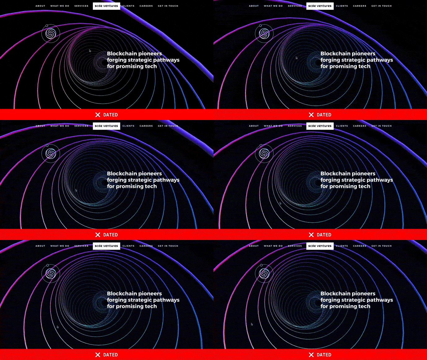
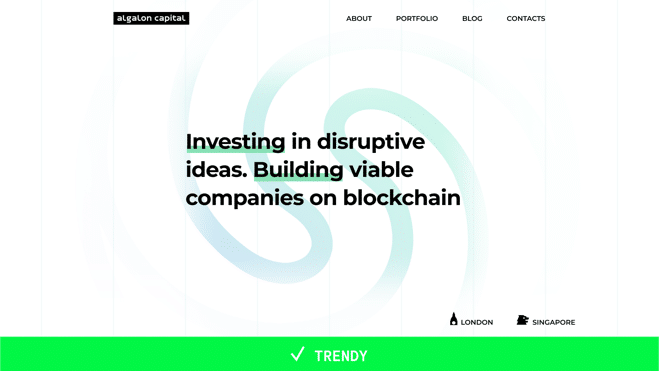
I delved into the depths of current design trends, offering valuable insights for those navigating this ever-evolving landscape. Our analysis revealed a clear shift towards simplicity, usability, and professionalism, starkly contrasting the rebellious neon aesthetic that once dominated the crypto space.
- Simplicity and minimalism vs. excessive details
An iron fist of simplicity, cleanliness, and minimalism rules the crypto industry and web design. This approach, born from the Mobile First revolution, demands simple solutions, clean lines, ample whitespace, and a limited color palette for the mobile realm, with refinements tailored to the desktop experience. With over 55% of internet traffic coming from mobile devices, the essence of this movement is the belief that simple techniques can elegantly represent even the most complex data arrays.
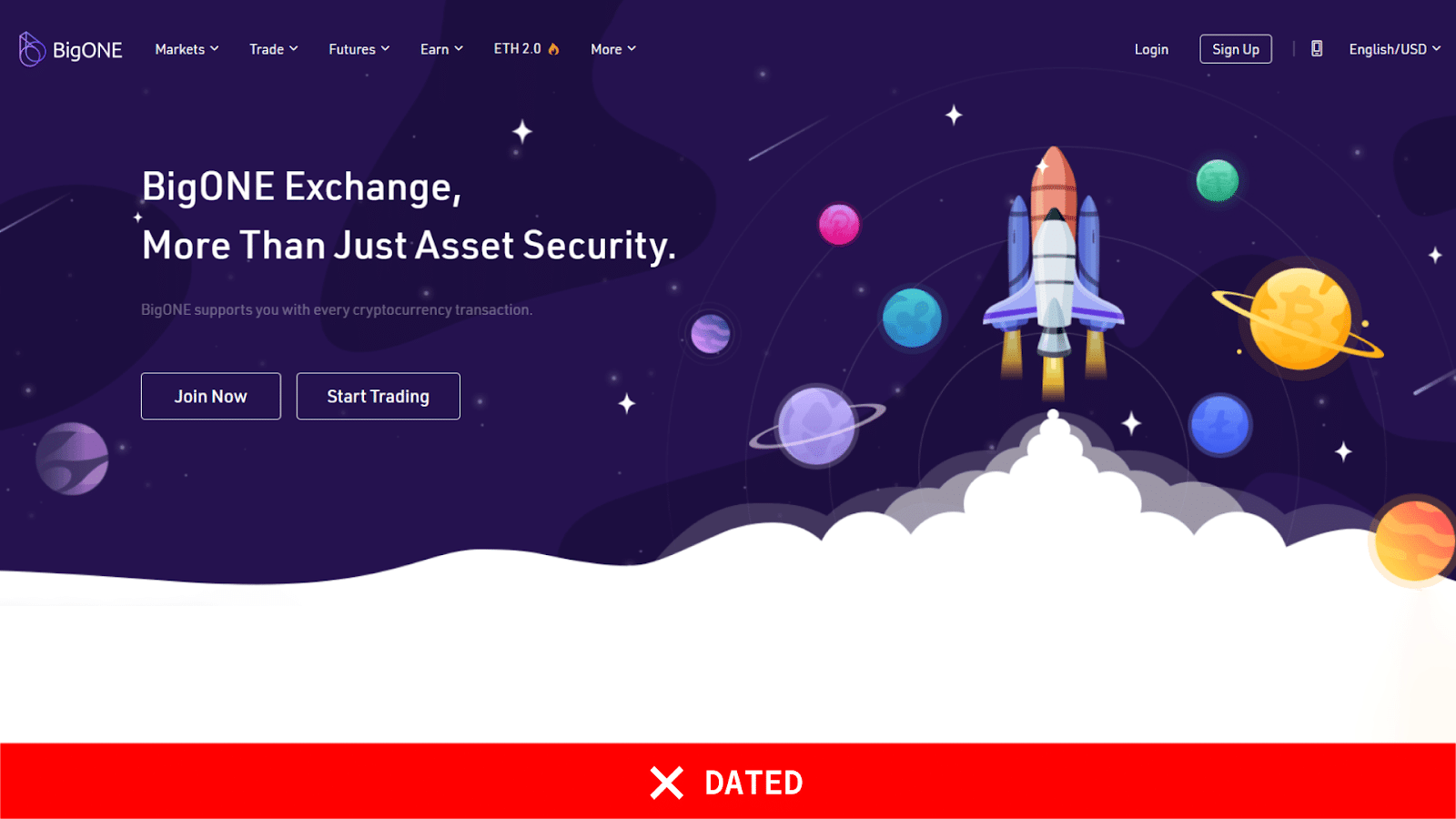
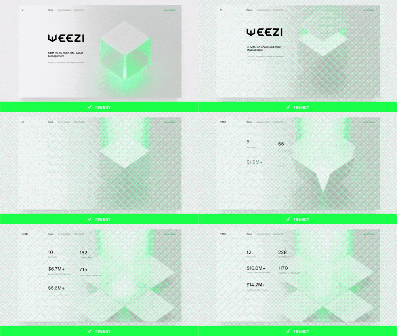
At the top is a glaring example of design gone awry. Once-fashionable futuristic graphics of space now render this website a childish spectacle, utterly devoid of trust. The lower one is a beacon of simplicity and minimalism—the Weezi project by Pixies.
- Focus on product/content: Less abstraction, more substance
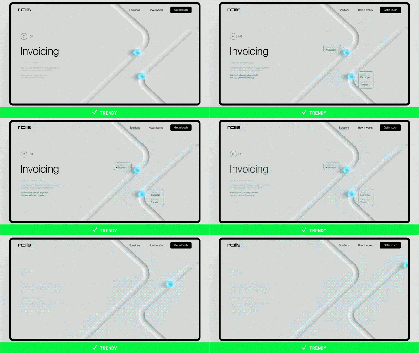
In today’s information-saturated world, content is the lifeblood of any successful digital product, and we are finally focusing on what matters: creating visually appealing and functionally valuable products. Take 3D graphics, for example. Once a symbol of cutting-edge design, they are now used to guide users through complex processes like virtual dashboards, smart home interfaces, and even payments. A great example of our work on the Rails project is that they used 3D objects to metaphorically represent payment moving along rails, making the process intuitive and engaging.
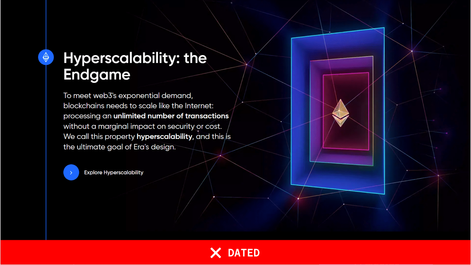
On the other hand, the design on the top is an example of everything wrong: its black background, neon color, and meaningless abstraction make it a visual mess. And do not even get me started on those tacky dots connected by lines—a design cliché that has been out of style for years.
- Classic colors and gradients: The new aesthetics of fintech
The days of retina-searing neon websites are vanishing, and the industry is set for a more sophisticated color palette reminiscent of traditional fintech, with ultramarine taking center stage. So, once a ubiquitous feature of fintech websites, gradients are now making a more subtle and elegant comeback, as seen on the Prismatic Capital website.
People have grown tired of the once-popular black websites that dominated the industry, leading to a rise in light themes that often combine gray tones with bold accents. For instance, the Coinflect website, with its masterful use of high-quality rendering, is showcased in close-up shots highlighting the intricate platform details.
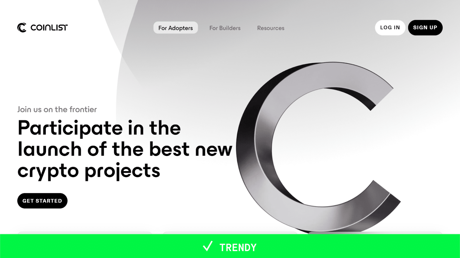
Another excellent example of rebranding is the Coinlist project. By forsaking neon colors that made the site look cheap and tacky, the project shifted to a trendier color scheme and adopted quality 3D elements, instantly elevating its brand image. No wonder color can increase brand awareness by 80% and influence 85% of consumers’ minds.

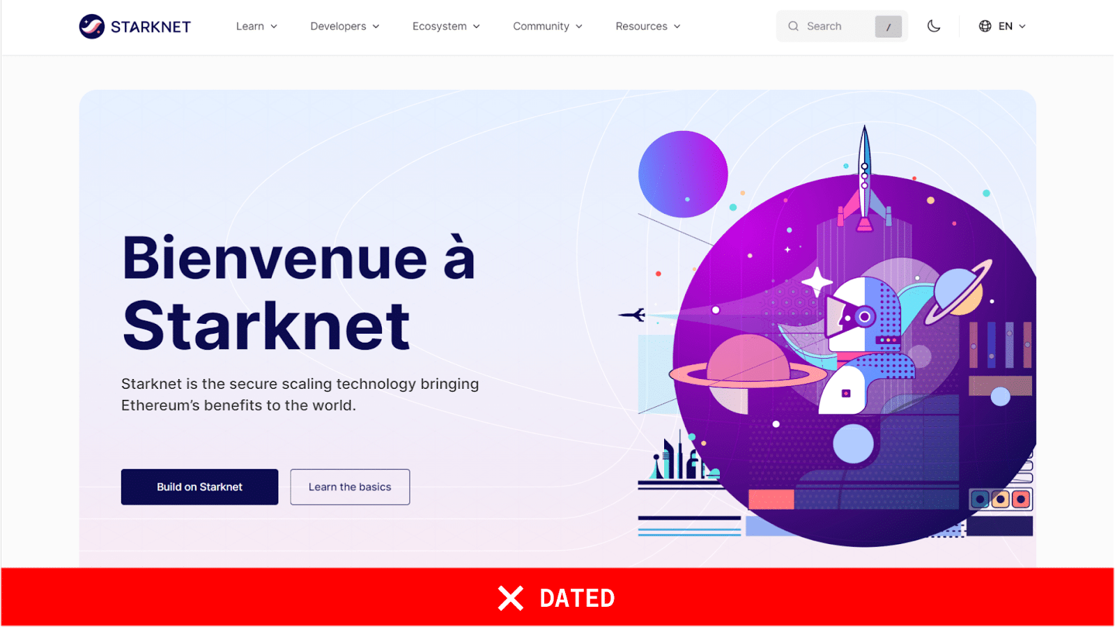
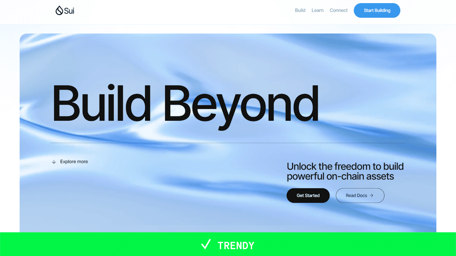
Starknet, with its space-themed elements and subdued typography, excludes an aura of quiet confidence. It is a design that does not need to shout to be heard. In contrast, Sui’s high-quality 3D render is a visual feast for the eyes: vibrant colors, intricate details, and smooth animations transport the viewer into a futuristic world.
The takeaway is clear: content should always take precedence over style. While design aesthetics can enhance a project’s presentation, they should never overshadow the core message. In the case of Starknet and Sui, Sui’s superior content and visually appealing 3D render make it the clear winner.
- User-friendly and empathetic interfaces with appealing graphics and quality animation: Functionality and emotional connection with users
Crypto projects embrace a sleek, modern aesthetic with clarity and information density. This trend is exemplified by the LENS Protocol project’s groundbreaking user interface, seamlessly blending clean, minimalistic design with playful yet sophisticated graphics. The design evokes a sense of tranquility and harmony, perfectly aligning with the brand’s eco-conscious ethos. Far from being childish, the design’s simplicity enhances interactivity and user-friendliness through subtle animations that guide users through the interface.
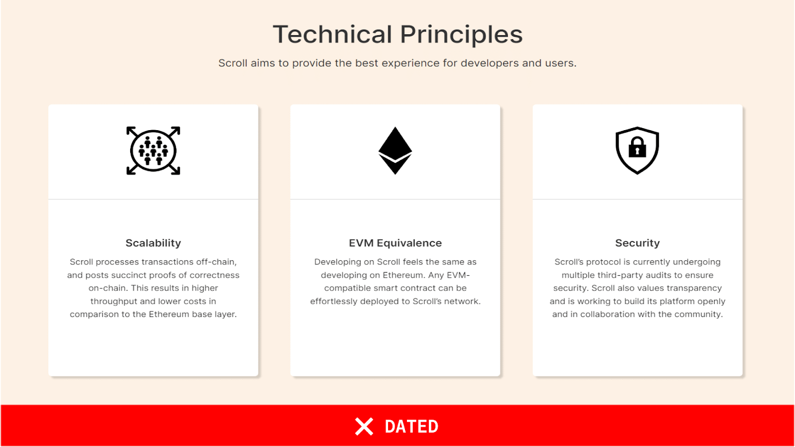
For example, the icons on the top
are a cluttered mess, lacking any cohesive style or sense of empathy for the user. They look like they were cobbled together from a mishmash of outdated clip art, reminiscent of the clunky icons from the early days of Microsoft.
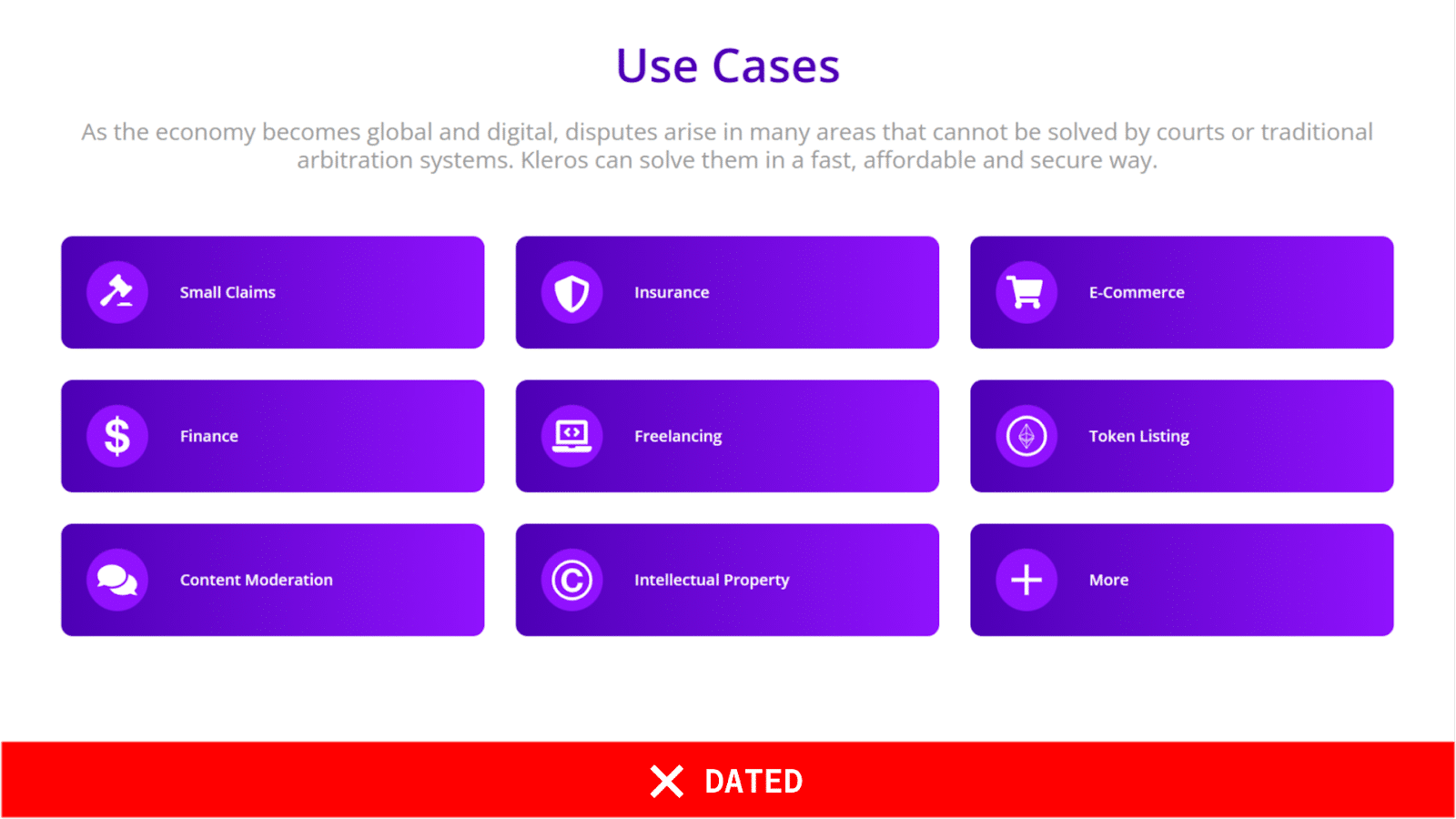

In contrast, the icons on the lower one are a breath of fresh air. They are unified and stylish and exude a friendly, welcoming vibe that puts the user at ease. It is clear that these icons were designed with the user’s convenience in mind, and this attention to detail shines through in the final product.
- Coding aesthetics: Emphasis on simple monospaced fonts and thoughtful composition
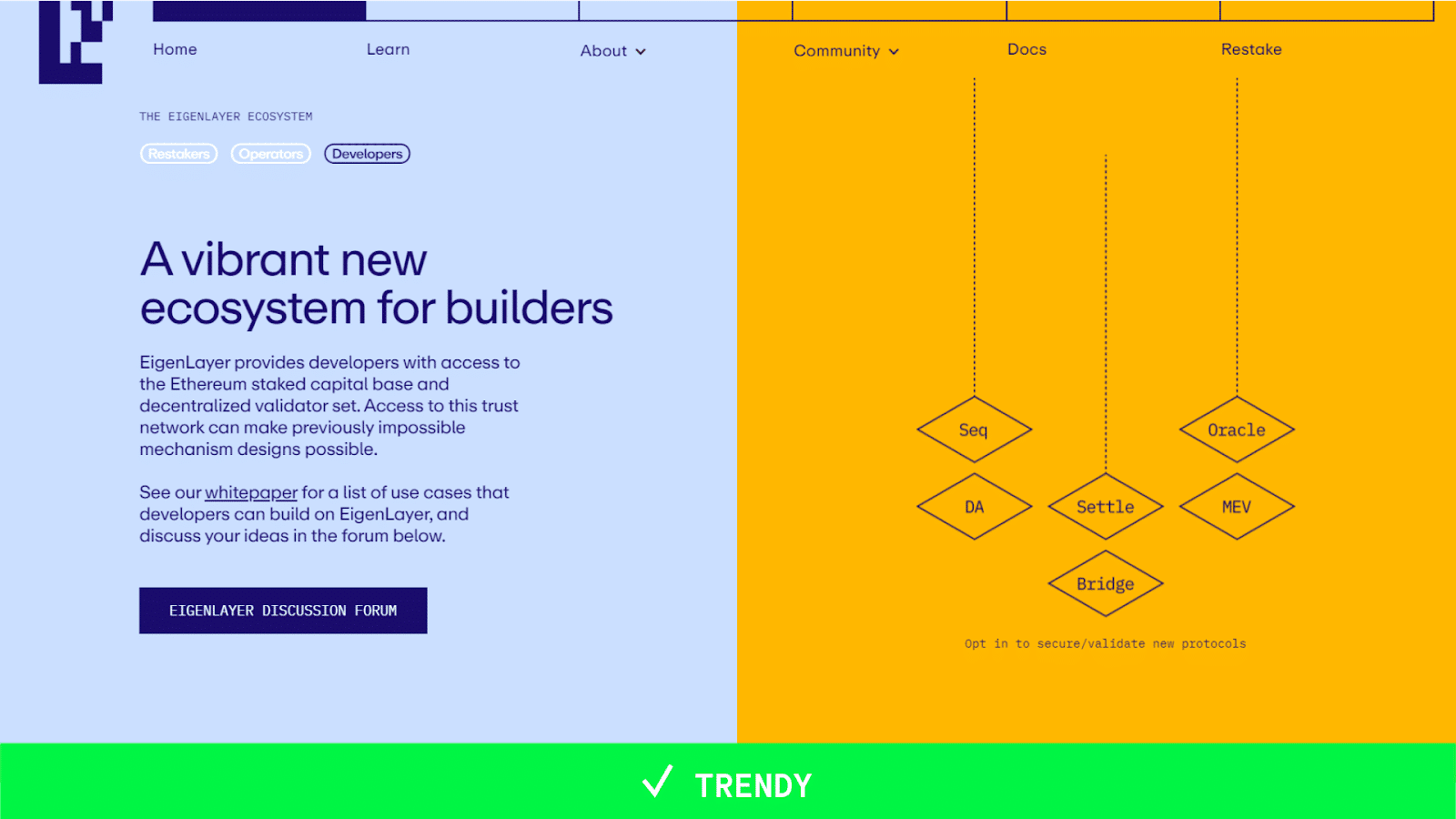
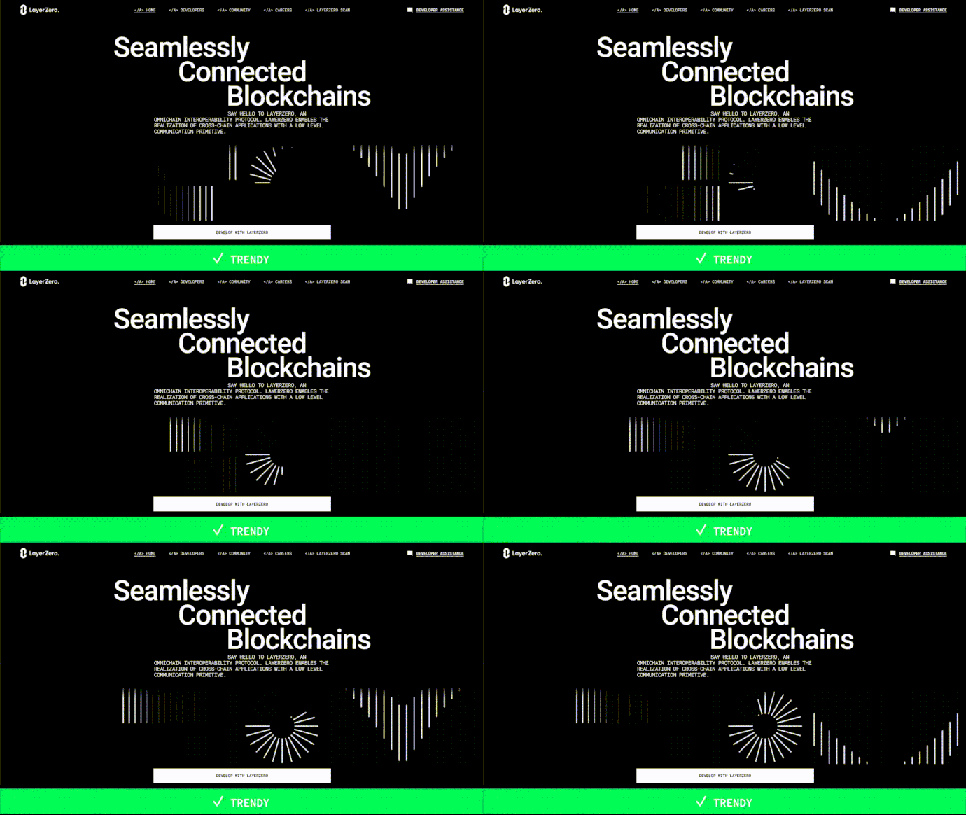
Monospaced fonts are the cornerstone of crypto design, and for good reason. Their clean, uncluttered appearance conveys a sense of technical expertise and trustworthiness, which is essential in the crypto realm. The Layer Zero website is a vivid example of this, with its masterful use of composition, typography, and animation to transform the simplicity of monospaced fonts into a symphony of motion and vibrancy. On the other hand, the Robotera project demonstrates how the wrong choice of monospaced font can lead to a cluttered and unprofessional appearance.
When used correctly, monospaced fonts are a powerful tool for crypto designers, but they can do more harm than good when used poorly.

Crypto projects are finally embracing a more mature, sophisticated aesthetic. Space and futuristic elements are still in vogue, but they’re used sparingly and tastefully. The focus is now on clean lines, user-friendly interfaces, and high-quality animation. This welcome change reflects the growing maturity of the crypto industry. As crypto continues to evolve, we can expect to see even more innovative and aesthetically pleasing designs emerge.
This article first appeared at crypto.news


